- You are here:
- Home
- About Symbols
- Guide to good symbol content
- Layout and design
Guide to good symbol content
Layout and design
The layout of your symbolised content plays an important role in how accessible and easy to understand it will be to a symbol reader.
There are three basic rules to bear in mind when symbolising content which will have a significant impact:
1) Achieve the effect of punctuation through layout
With the added visual information provided by symbols, punctuation marks can be easily lost. This means that the information provided needs to be presented in a way that is as easy to look at and to comprehend as possible.
One way of achieving this is by your layout effectively performing the role of punctuation. In a typical document, this could be accomplished by making sure that there is sufficient white space between each line.
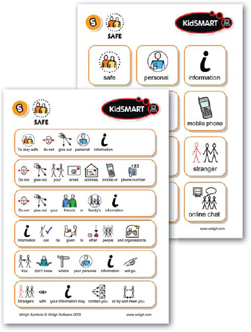
For more complex items, such as a timetable or a series of instructions, drawing a box around each sentence is a simple and effective way of showing where sentences begin and end, making sentence structure easier to interpret.

2) Don’t use more than eight symbols per sentence
As a general rule, most of us can only think about or remember four things at a time, and we tend to subconsciously group things like telephone numbers into sets of two, three or four numbers. When there are more than two or three of these sets, we find them increasingly hard to commit to memory. The same is true for symbols.
If there are more than eight symbols in a sentence, it can become very difficult for a symbol reader to understand the message as a whole. Remember, not every word needs a symbol (see ‘Replacing and combining text’). As a rule, it is best not to use more than eight symbols in one sentence.
3) One sentence per line
When writing symbol-supported content, every sentence should begin and end on the same line. The end of the line effectively performs the same function as a full stop, helping the symbol reader to recognise the beginning and end of each message within the content. If you have no choice but to break a sentence across lines, it is best if the break in the sentence is at an ‘and’ or a natural speaking pause in the sentence, and the next sentence then starts on the following line.
If one sentence ends and another begins on the same line, it can be very easy for a symbol reader to misunderstand the sentence’s meaning and assume the start of the second sentence to be part of the first. It is important to remember that symbol readers may not be able to understand punctuation, so commas and full stops may not be noticed or understood.
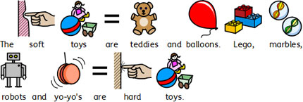
In the first example to the right, the second sentence is split over two lines. The symbol reader might not see or understand the full stop and misunderstand the messages, therefore assuming ‘Lego’ and ‘marbles’ to be part of the first sentence and contained within the soft toys category.
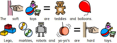
In the second example, where the text has been arranged so that each sentence begins and ends on the same line, it is far easier for the two messages to be understood.


Guide home | Next - Checking your content
